The scientific reason you need to paint your home office green
With WFH reshaping the future of work, we found out the best colour to incorporate in your home office
Interior design Instagram accounts have enjoyed newfound popularity during the pandemic. So far, there’s been plenty of focus on how to transform your house into a home – what about creating the perfect home office space? Whether you’d like to increase your productivity, stay focused or reduce stress, choosing your wall paint colour is the first and most important step.
Colour psychology is the study of hues as determinants of human behaviour. It perceives colour as a communication tool powerful enough to signal action, influence performance and even determine consumer purchases. A recent study by Stelrad found that males are least productive when surrounded by orange or purple – but what colours should women avoid?
To help you get the most out of remote working, here’s a list of the psychological pros and the cons of the most popular home office colours, and why your WFH office should probably include a desk plant…
Neutral tones
Psychologist and wellbeing consultant Lee Chambers MSc MBPsS examined the psychological effects of paint colours in relation to the emotions they influence when applied in a home office. The study revealed the most common home office colour. Among the 4,325 participants, 31% declared white was their most favourable paint choice, followed by grey and cream, with 23% and 17% respectively.
An off-white colour palette is perfect for your Instagram aesthetic, but not recommended for your office space. These colours have been found to induce a lower mood in women. Lee Chambers explained, "A University of Texas study concluded that offices without a splash of colour, especially those in neutral white, grey and beige tended to induce some sad and depressive feelings, especially for those identifying as female.”
Yellow
Coming in 4th among the list, with 13% of those surveyed admitting to having a yellow home office wall, it definitely consists a solid option, especially for the creative ones. Yellow is tightly linked with emotions such as happiness, warmth, and optimism, resulting in its often use in innovation labs and creative spaces. The study also highlights yellow as a “strategy” to effectively increase retention of information. Despite this, the colour of the sun can be a rather tricky one, as overuse of yellow can surface a “yellow streak”, inducing eye fatigue and interrupting the emotional balance.
Red
Red is one of the least popular colours to paint a home working space. However, it is proved to be a key-colour when establishing an attitude. Though red represents strength, energy, and excitement, its luscious colour can easily become overstimulating, causing a loss of focus and increasing the potential for mistakes. “Like a little natural energy bar” red works great for physical tasks, but for a WFH office, it seems rather a brave choice, as a mistake can rapidly dissolve any excitement, listed as a benefit of the colour.
Blue
Refuting the disadvantages of red, blue promotes calmness and reduces the pulse rate. Blue, also known as the colour of productivity, enhances the feeling of serenity, therefore can increase work output. Suggesting loyalty, honesty, and reliability, blue is the most favourable one among the corporate world. However, as Lee explains, “too much blue can leave you a little too relaxed and blunt your innovative streak, so consider adding some warm colour accents”.
Green
Tightly linked with the healing power of nature, green is the colour of serenity and growth. Adding a hue of greenery to your home office is believed to dissolve stress and help longer-term focus. In a similar way to blue, going green can boost productivity (and therefore performance). We can see more shades of green than any other colour, so it causes less eye fatigue, which helps our focus and attention.
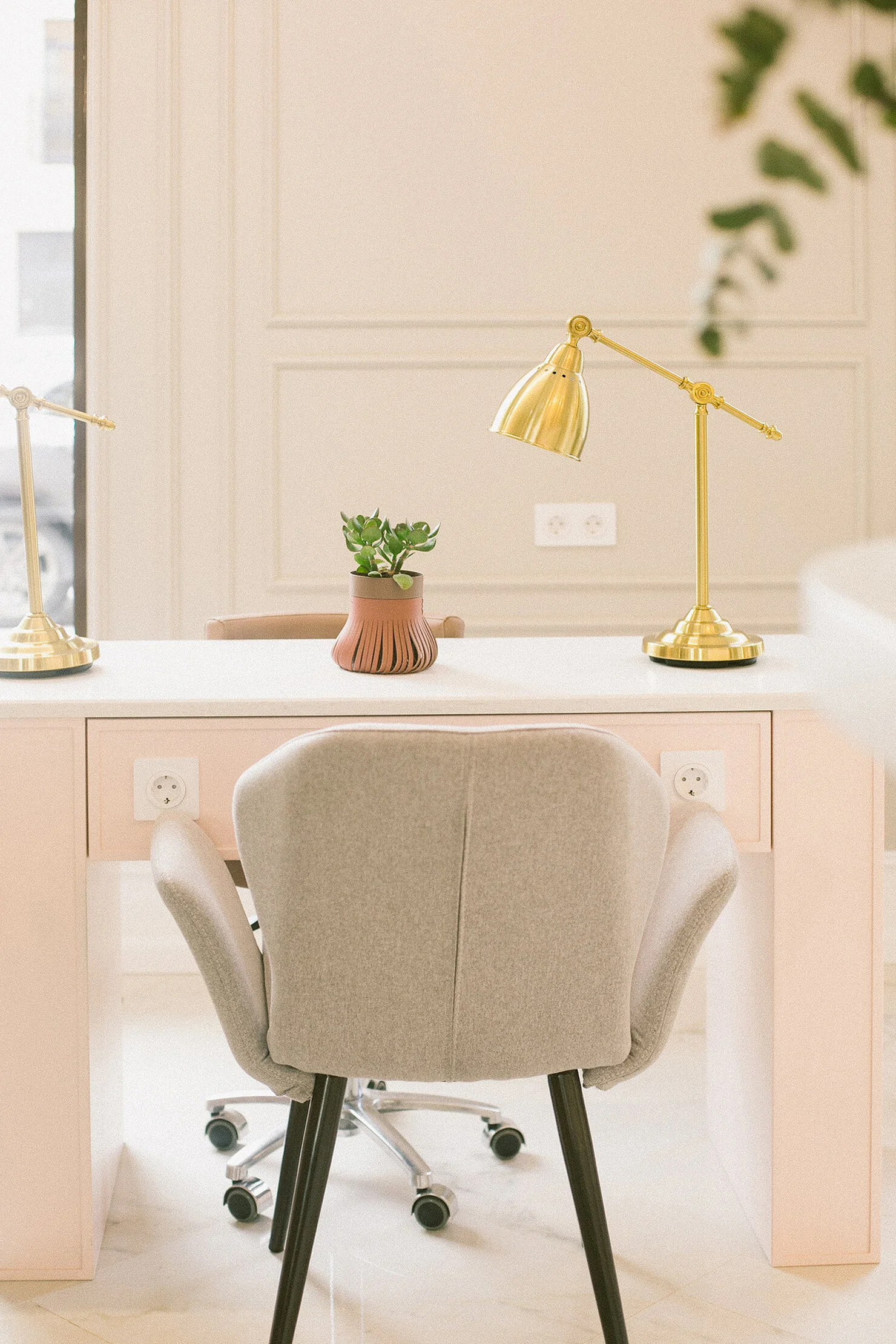
Another way to add the purifying benefits of green in your eye line is by having plants on your desk, “Your desktop's colour is continually in your eye line and is a perfect place to utilise productive colour, get some plants in your eye line, and you get both the green vista and the air-purifying benefits too." said Lee.
The study of the optimal WFH colours does not limit itself to the hues that work best in our eye line. Remote conferencing video platforms like Zoom offer great alternatives to customise your virtual “portrait”, but a physical background alternative could allow your interlocutor to get a sense of your personal and working traits. A theme of peach and pink will infuse to the atmosphere welcoming and happy tones, while purple is noble and serious.
Mini Green House, £69, from Design House Stockholm
Finally, one might question why doing a complete renovation when offices are about to reopen? Before raising the argument of the importance of change, by re-painting your home office one gets to absorb the beneficial use of colour as a healing method. (Especially if you choose green.) Even if digital workplaces are soon to be a distant past, you’ll still have that green room to return home to and relieve your work stress.


